
Who knew that the last line of a blog that was written almost two years ago predicting a condo for my son Jonathan, would actually become reality. That’s called the Law of Attraction folks and I’m a believer. First, a little history. Johnny’s previous move was a little over three years ago. That home was a semi fixer-upper that you can read about here and also here.
He eventually decided the home was a little too big for him and would be better suited for a family. He had a contract nine days after the house went on the market but the final sale and closing seemed to take forever. Having been in the same house for 25 years, I’ve forgotten how long and drawn out that stuff gets. In the meantime, he found a three bedroom condo but just needed his house to close, to finalize the deal. Eventually, things fell into place and Johnny’s Condo became a reality. In fact, the condo’s first floor has turned into an Airbnb decorating DIY.
His new condo is in what is considered to be in a “trendy” area of Dallas. Not a lot of folks over the age of 50 in this particular neighborhood! The area is within walking distance of restaurants, bars and shopping and a lot of other condos! Did I mention there are A LOT OF CONDOS in this area? With that in mind, our goal here is to make his condo stand out to future buyers (in a good way). The long term plan is to probably sell in two or three years. The decor plan for this condo is to keep it somewhat minimal for the millennials but esthetically interesting. I had to convince Johnny that he would need a few upgrades. This is important so that he could set his condo apart from the other 20 or so identical units in his complex.
ENTRY
The condo is three levels (much to the detriment of his bad knee). The first level is the one that we will focus on in this blog. It’s simply the entry, stairs to the second level, and a small bedroom with a full bath and closet. Let’s start with the entry. It’s pretty narrow, but has good natural lighting from a glass front door and two clerestory windows. Basically the entry was only large enough for a narrow console table, a runner, and some art.
![]()
![]()
![]()



BEDROOM
At some point, Johnny decided to turn the downstairs bedroom into an Airbnb – okay, I got this. Furnishing an Airbnb bedroom requires a little more thought than just furnishing a guest bedroom for family and friends. Comfort and making the stay worthy of a 5 star review is the key! Keep in mind this is a condo and this bedroom is tiny.
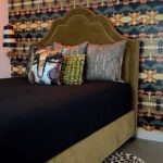
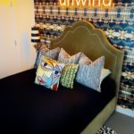
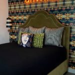
The model for this particular unit had a trundle bed up against one wall and a home office setup across from the bed. Johnny didn’t like the idea of a trundle for Airbnb purposes, so I did what any good mama would do, I gave him one of my beds 😬. This is the bed that was featured in a previous blog that you can read about here. Of course, you know what giving Johnny that bed means for me – a new bed. Woooohoooo! We outfitted it with a very comfortable mattress, mattress pad, sheets, quilt, and a few fun pillows. Not being able to choose just one pillow, I ended up ordering several. I’ve included pictures of all of them below.
Now for the fun stuff! The wallpaper is from a company called Spoonflower. What I love about Spoonflower is their massive selection. Not only can you get wallpaper, you can get matching fabric. Yes, I am all about “matchy-matchy”. In fact, I hear it’s back on trend for 2020. I settled on this particular pattern after consulting with my design team (daughters Melinda and Abby and granddaughter Lani 😉).
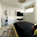
I inherited the leopard rug from Abby. She was originally going to use it in her newly made over playroom but decided on something else. I catty-cornered it under the bed and I feel like it gives a “visual punch” to the room. How fun are neon lights? You see them everywhere these days. This is the second time I have used one. They make a big impact for a relatively low price. It took us a while to come up with the wording, but eventually UNWIND won out. In fact, we’ve named the Airbnb room “UNWIND TIME”. A little play on the phrase “Wine Time”🍷👍🏻. I purchased the light from a company called Yellowpop. They have stock signs or you can customized one like I did.


The room came with a standard ceiling fan and to say it was “plain Jane” was an understatement. This is one of those standard features that I talked about earlier that’s gotta go! Yes, we like the idea of a ceiling fan, but why not have one that doesn’t look like a ceiling fan. I searched forever and decided on this one. This ceiling fan comes with a light and a remote and puts out a good amount of air. After seeing it on several internet sites, this one from Wayfair had the cheapest price.
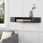
The room needed a desk, but I didn’t want a big clunky desk. I settled on a hanging desk/media console . It’s big enough for a lap top and it has some extra storage which is important for such a small space. I slid this ghost chair underneath it and it’s a good area to get a little work done or if you’re like me and like a vanity for applying makeup, it’s perfect.
I originally was going to use the hanging desk for a coffee pot and a mini fridge, but there just wasn’t enough room for all that and a desk area too. So, a small rolling cart to the rescue. It was the perfect size for the space and does a good job of holding the coffee pot, all the coffee condiments, and a mini fridge. Speaking of coffee stuff, did you know you can personalize disposable coffee cups on this shop on Etsy? We had some made with the “Unwind Time” wording for the Airbnb guests. The cool dual mirror is from Macy’s and the window treatment was another creation by Mona G Studios. These faux roman shades are my absolute favorite, inexpensive solutions for covering up blinds.

BATHROOM
The bathroom is small but functional. To make the builder grade mirror look more custom, we added 3″ beveled strips along the edges. There was no way we could remove this mirror and replace it with something more interesting without damaging the walls. I’ve used these beveled strips in my own home and it really makes a huge difference. Once again, we had Ann, our seamstress, make a custom shower curtain. Abby and I love these shower curtains. She has two in her home and I have one. The valance is mounted with a tension rod at the top of the ceiling and the two panels are also mounted with a tension rod under the valance. Because they go from the ceiling to the floor, they make a real statement. I used a plain white fabric and edged it with the fabric that coordinates with the wallpaper.
Because there is virtually no storage space or drawers inside the bathroom cabinet, we installed these shelves. In fact, we also installed them in the guest bathroom upstairs. To me, they are essential for organizing all the stuff that you accumulate under a bathroom sink. We filled them with toiletries and other essentials for the Airbnb guests. We hung these pictures from Z Gallerie and that is it. The 1st floor is done son!! This Airbnb decorating DIY on Johnny’s condo (1st floor) was a fun project and here’s hoping for that five star review. ⭐️⭐️⭐️⭐️⭐️



Sandy, you out did yourself!!!! This is beyond fabulous!!!! Who would not want to stay there!!!!!! You are incredible!!!
Thanks so much Judy! If you ever need a place to stay in Uptown, come and be our guest!!
This condo is fabulous and 5 stars all the way! I sure wish “Unwind Time” was my bedroom! I especially love the wallpaper and the shower curtain!!! #nailedit
Thanks Melinda! I mean what would be better than a mini fridge and a coffee maker in your bedroom ? 😂
Sandy absolutely beautiful. I always love everything that you do. This is definitely a 🌟🌟🌟🌟🌟
Awww thanks so much Pam!!!
What an awesome idea!! I love everything about it!! Love that wallpaper! You nailed it again!
Thanks Abby. We appreciate you reading the blog:)